Hi, all!
I am a first time poster, but we have been using phplist for our dance school for I think almost 7 years now and are really happy with it. Until four weeks ago, we were still using a non-responsive newsletter template, which looked horrible on most mobile devices - which is why we changed. But now, we apparently have a different problem: The responsive theme looks great on my devices (iPhone, iPad, Outlook for Mac) as well for the dance school owner (Thunderbird on PC, iPhone) and many, many of the students. However, for some of the students, it looks really bad - the images are way to large, which in turn makes the font way to small to read.
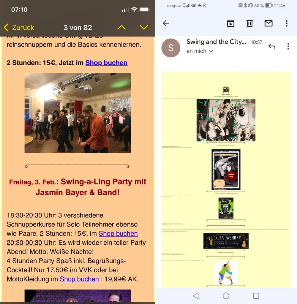
On the left is what it should look like, on the right how it looks for some people:
Is that a problem in my css or is it a problem on the receiving end with setting on the respective devices? My CSS looks like this:
/All the styling goes here/
      img {
        border: none;
        -ms-interpolation-mode: bicubic;
        max-width: 75%;
      }

      /* -------------------------------------
          BODY & CONTAINER
      ------------------------------------- */
      .body {
        background-color: #ffffcc;
        width: 100%;
      }
      /* Set a max-width, and make it display as block so it will automatically stretch to that width, but will also shrink down on a phone or something */
      .templatecontainer {
        display: block;
        margin: 0 auto !important;
        /* makes it centered */
        max-width: 75%;
        padding: 10px;
        width: 580px;
      }
      .logo {
      padding-bottom: 10px;
      }

      /* This should also be a block element, so that it will fill 100% of the .container */
      .templatecontent {
        box-sizing: border-box;
        display: block;
        margin: 0 auto;
        max-width: 1200px;
        padding: 10px;
      }
Thanks for the help and all the great work you do on phplist!
Best,
Jens