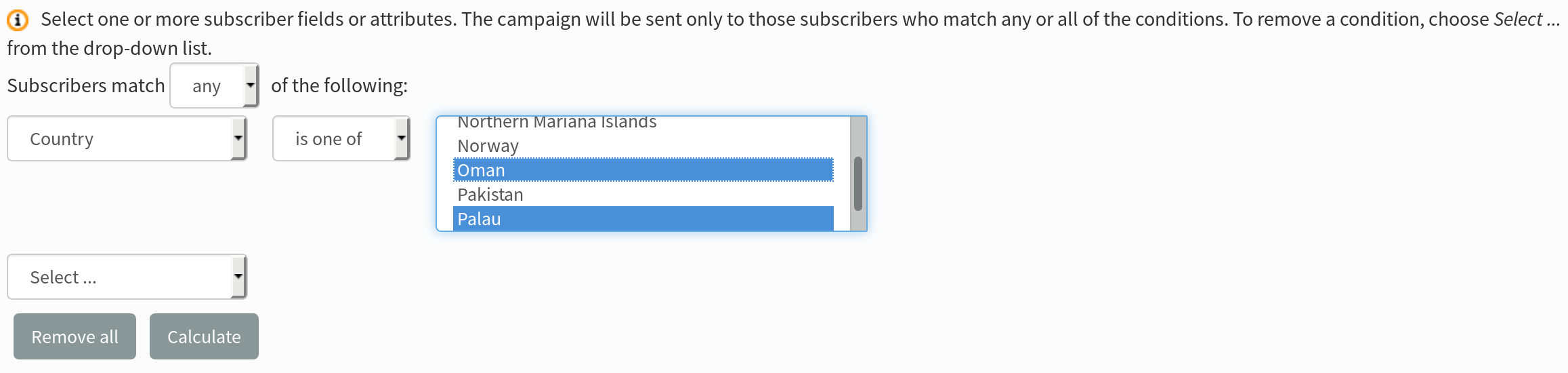
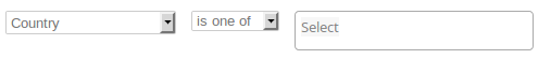
The Segment plugin uses an HTML select multiple input for configuring conditions for some attributes, such as ‘Country’ (on the dummy development db). This type of input is a known usability problem (users are not familiar with ctrl+click to select), and we’ve had internal feedback indicating that use of this field has been misunderstood.
@samtuke I think that the main usability problem is that for a long list of options it is difficult to see exactly which have been selected. The current approach is fine for small lists, maybe up to 10 entries.
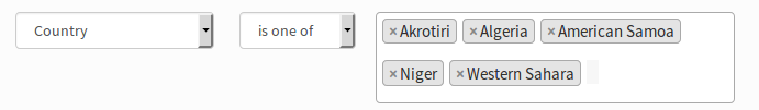
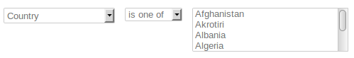
The plugin already uses a js multiselect package, Select2, for the list of saved segments. Using that for the Country field now looks like this
The area that displays the selected options will increase in height as more options are chosen, which might look a bit awkward if lots of options are chosen.
To try this out for yourself just add this snippet to the script.html file
@samtuke I want to do some more testing to see how it displays with different lengths of list values. Do you think that the presentation is ok for both themes, and also for, say, a list with short values, e.g. ‘blue’, ‘green’, ‘red’ etc?
But my main computer failed last week and doesn’t stay up for too long, so I cannot do much until the new one is delivered. Hopefully later this week.
@duncanc Sorry to hear about your computer; hope the new one does what you hope!
Regarding the themes, the change seems to be OK on both Dressprow and Trevelin. The input field is styled differently (sspecifically a different height and rounding to the others on Dressprow), but it’s not a problem that need block the patch in my view.
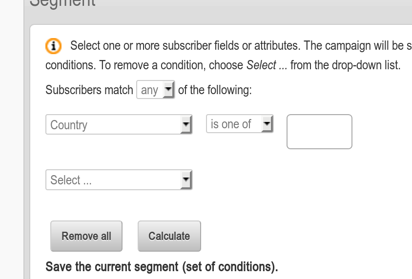
Regarding field length, this is more of an issue, as currently the field width is taken from the length of the default value. If that happens to be very short (e.g. default country is UK) then the menu becomes unwieldy as the other longer items cannot be read.
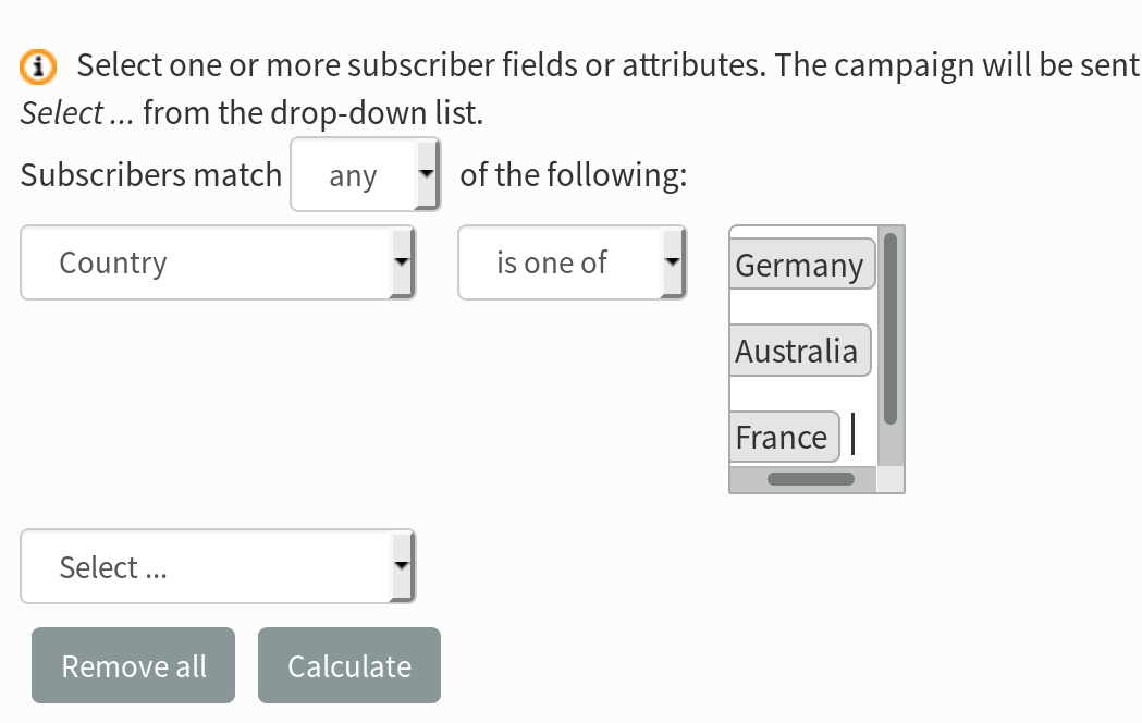
@samtuke I don’t think that we want the list to be as wide as the widest item automatically but the best result that I can get is by specifying min and max widths. Try adding this to the styles.html file
That works well in my testing on desktop and mobile viewport sizes.
I noticed that there is no dropdown arrow however (was also the case before) to indicate that the input is a menu that must be clicked. Can Select2 provide this?
@samtuke Select2 allows add a placeholder, maybe “Select”.
An ordinary multiselect list doesn’t have a dropdown arrow but displays part of the actual list with scroll bars.